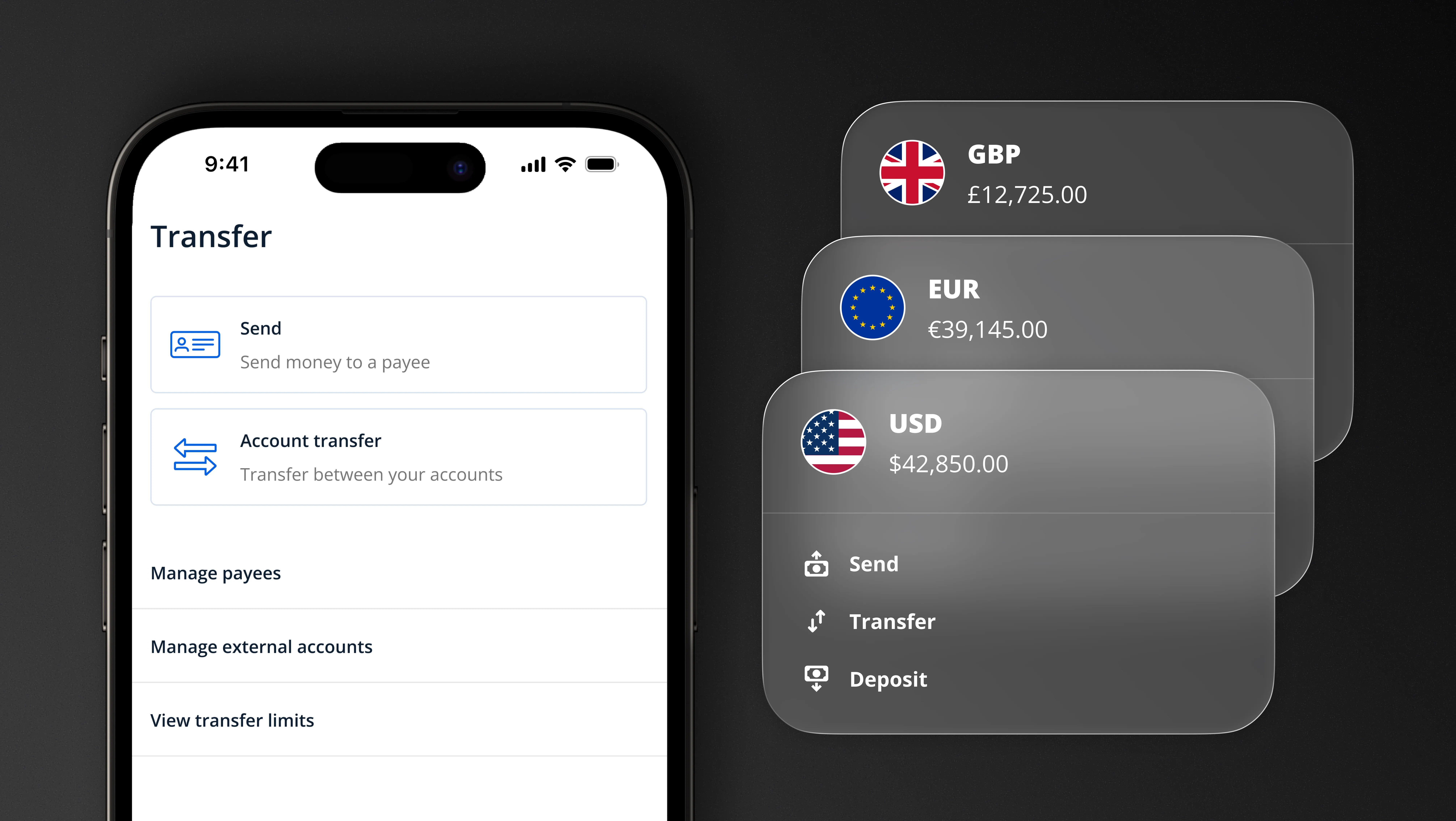
Design System
Documentation as
Infrastructure

TL;DR
Rebuilt a fragmented, partially-built Figma library into a fully documented design system with token architecture, component guidelines, and an adoption strategy — serving 5 products, 4 designers, and 50+ engineers across a 3-year engagement at RYVYL.
Role: Sole Design System Designer. Took over an inconsistent library and rebuilt it end-to-end: token architecture, component documentation, usage guidelines, cross-team adoption strategy, and a Storybook proof-of-concept for engineer-facing component reference.
Problem: Design knowledge lived everywhere and nowhere. Developers re-derived spacing values from screenshots. PMs referenced stale screens as current. Designers detached components because the library was undocumented. Every handoff required back-and-forth clarification — across a 12-hour time zone gap, that added up to weeks of lost time per sprint across five products.
Solution: Built in layers — foundations → tokens → components → adoption. Introduced product-level color modes at the primitive layer: each product (reu, nems, nanokard, and others) had its own named primitive token set, so rebrands cascaded automatically without touching a single component. Documented the decisions behind components, not just the components themselves, so teams could act without asking design.
Impact: ~25% reduction in frontend dev timelines. ~70% reduction in design-related Figma comment threads per project. 5-product color theme switching without component-level changes. Handoffs became self-serve across a 12-hour time zone gap.
Overview
Before this system existed, design knowledge at RYVYL lived everywhere and nowhere. Across multiple products and a growing cross-functional team, every handoff was a negotiation. Designers pulled from detached components. Developers re-derived spacing values from screenshots. PMs referenced screens from two sprints ago as if they were current. The questions never stopped. They moved to the next Figma file.
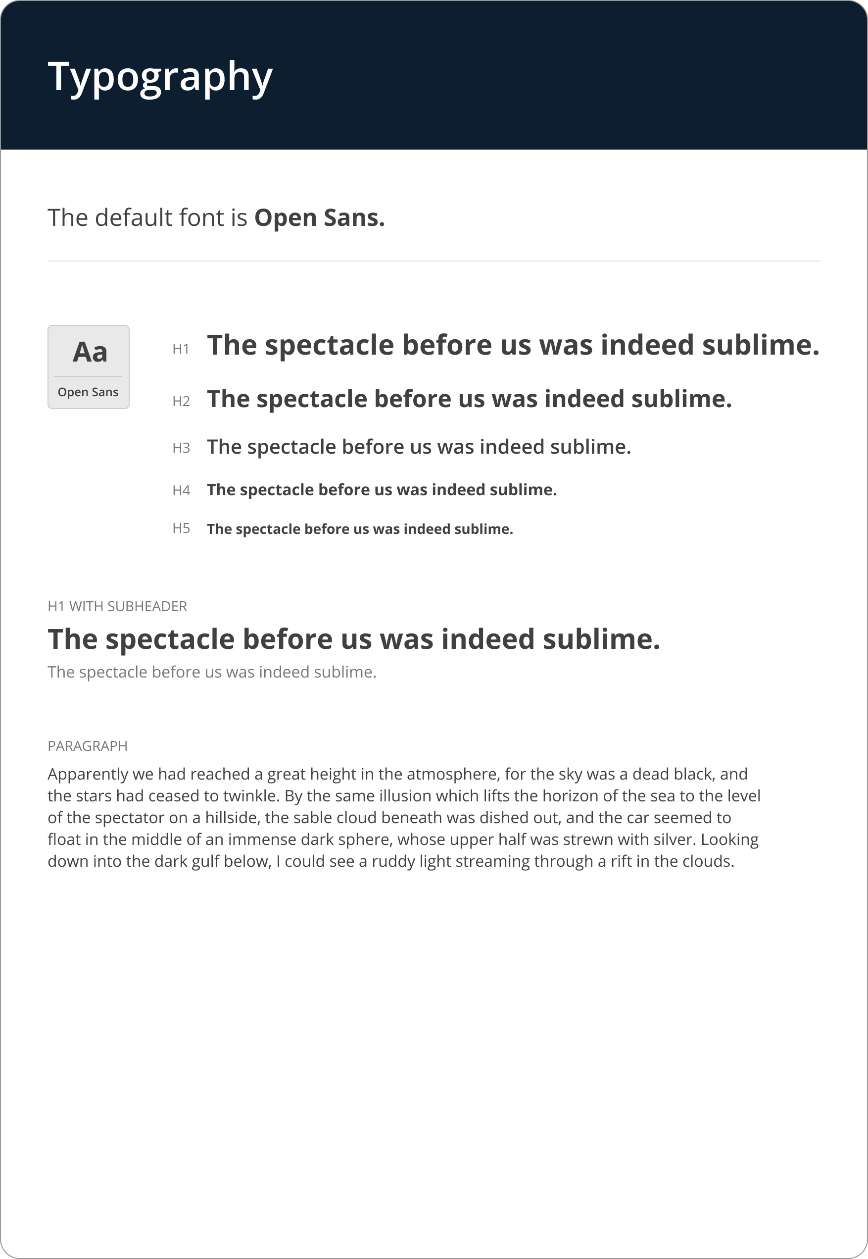
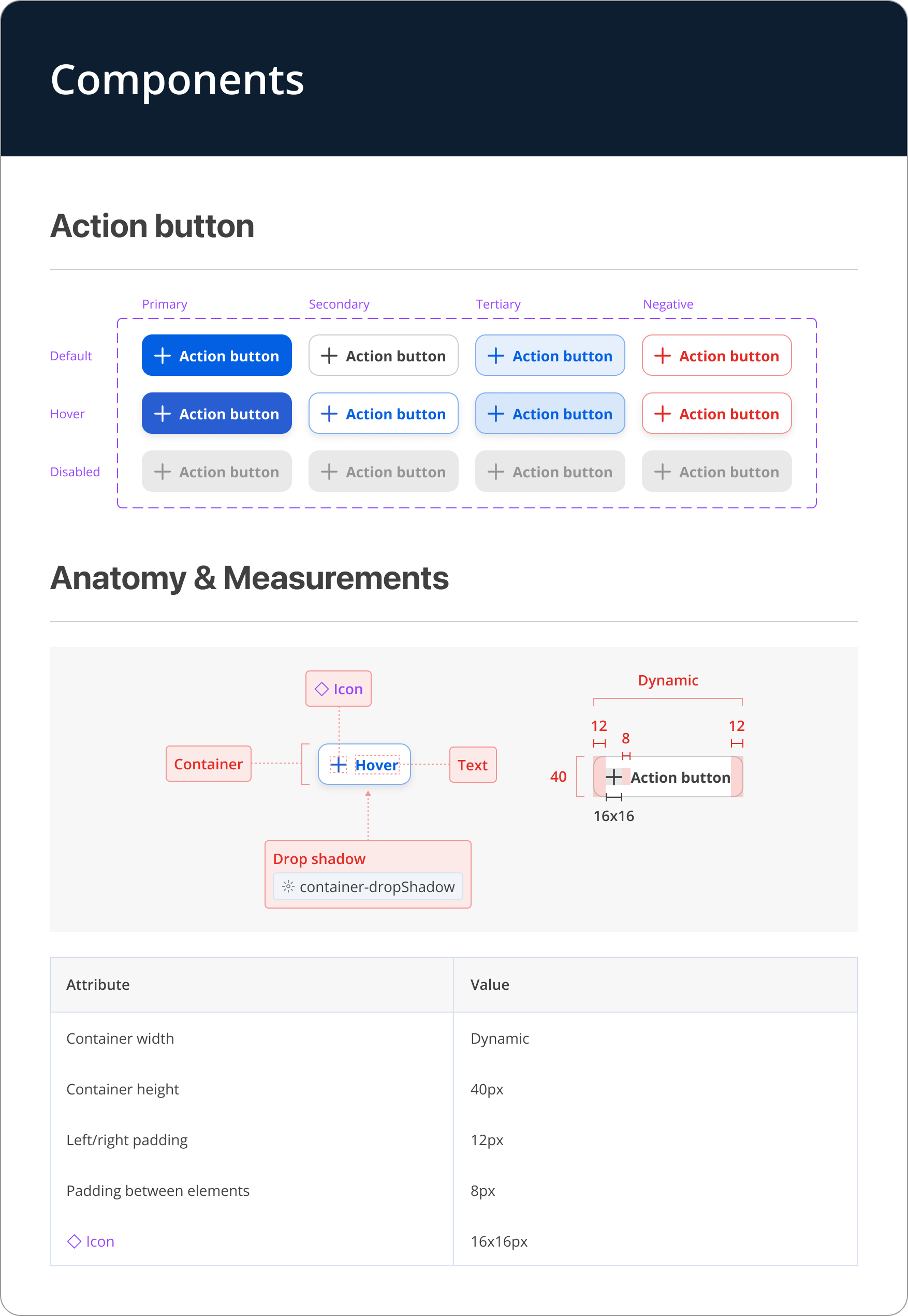
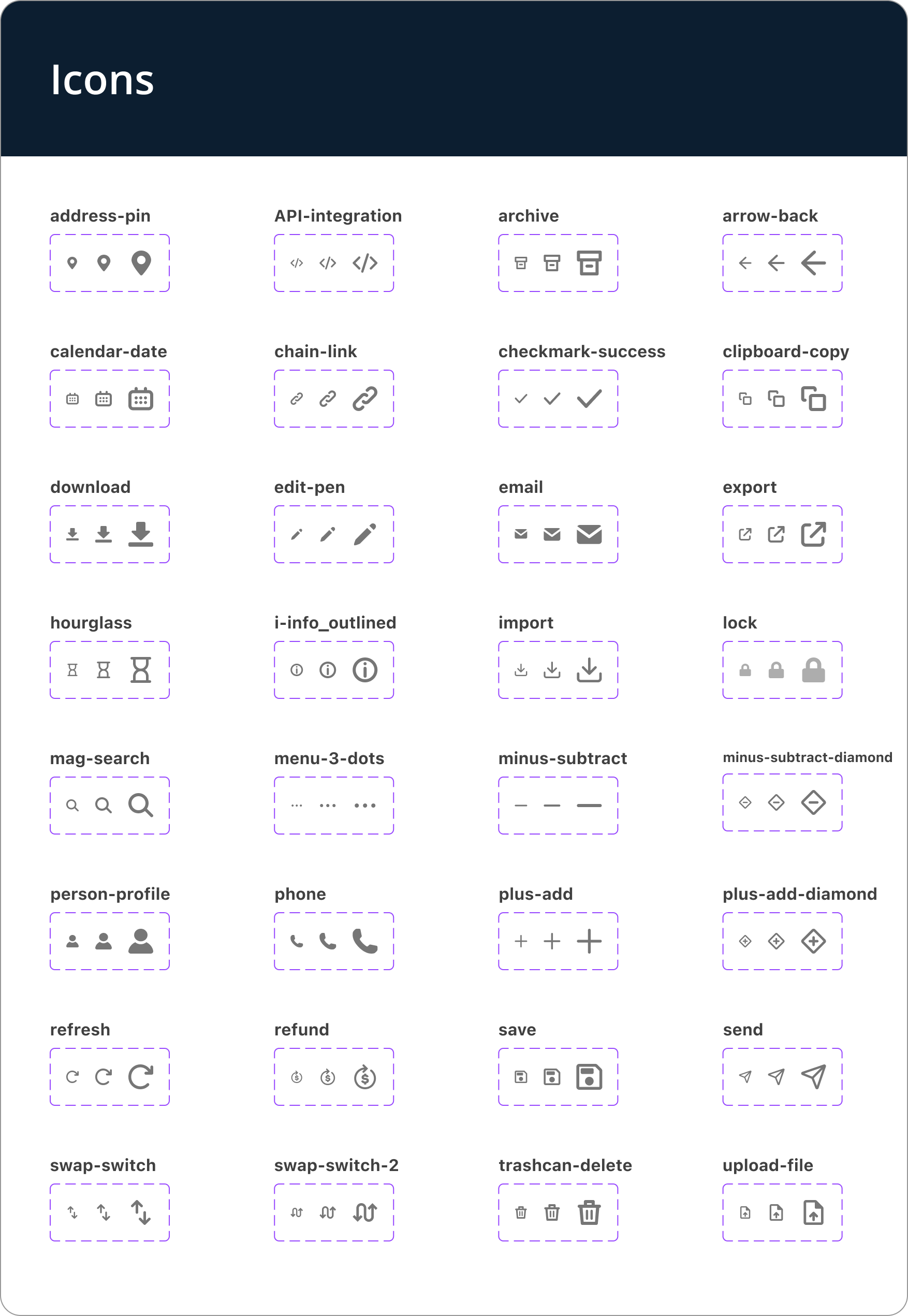
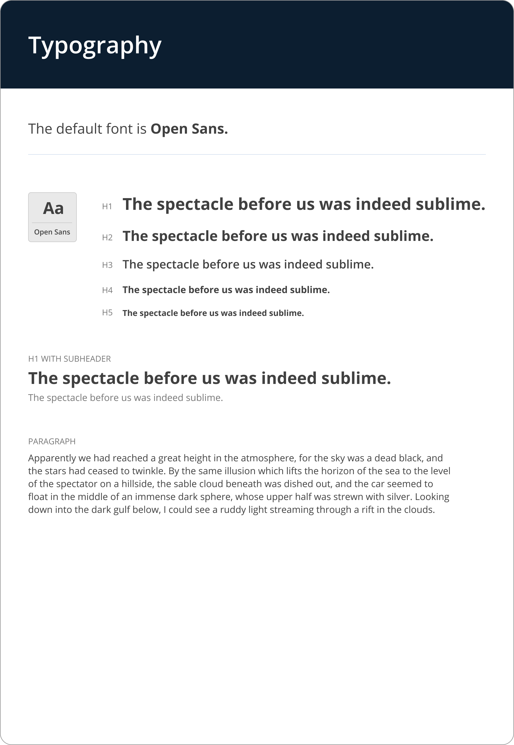
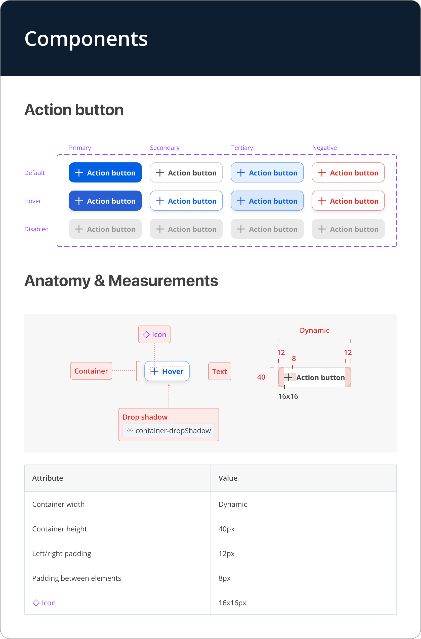
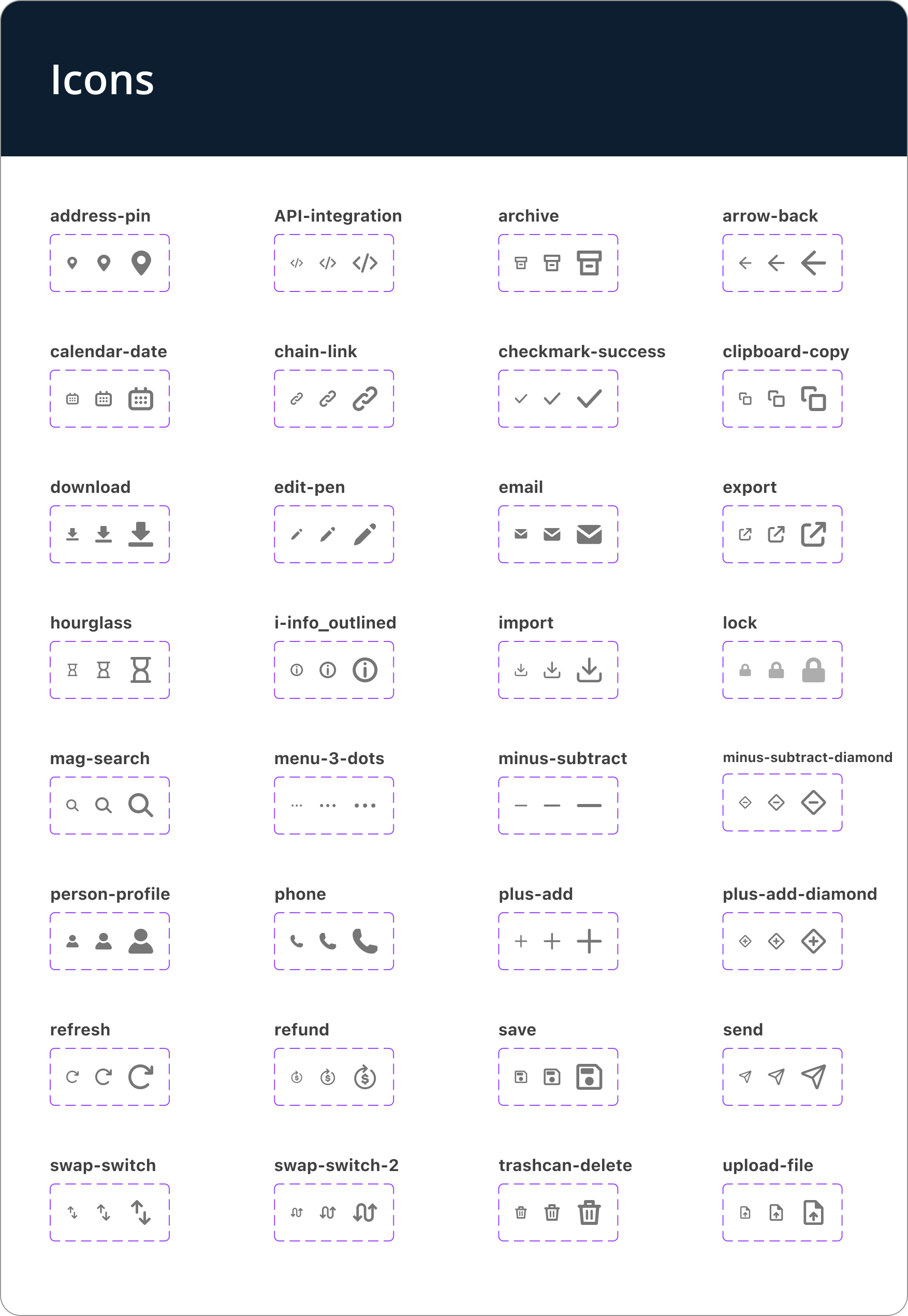
Over three years, I took over a partially-built library and rebuilt it with a token architecture, documentation, and an adoption strategy it lacked: a single source of truth for color, typography, spacing, components, and usage guidelines across 5 products and a team of 4 designers and 50+ engineers.
Problem & Goals
Whoever opened the file made every decision from scratch.
A developer couldn't find the correct hex value, so they'd drop a comment and wait (sometimes for a full day, across a 12-hour time zone difference). A PM would reference a screen from two sprints ago, not realizing it had been updated. A designer joining a new product would detach components because they didn't know how the library was structured. Each moment was small. Across a sprint and five products, they added up to weeks of lost time.
Nobody was at fault. Nobody had established rules for how the system should work, so everyone improvised their own version.
Developers had no shared reference for design specs and defaulted to asking me. I was fielding questions about previous projects while trying to ship new ones. I proposed the design system to move those answers into documentation.
Design challenge: The challenge was making the decisions behind the components legible enough that teams could act without asking.

Process
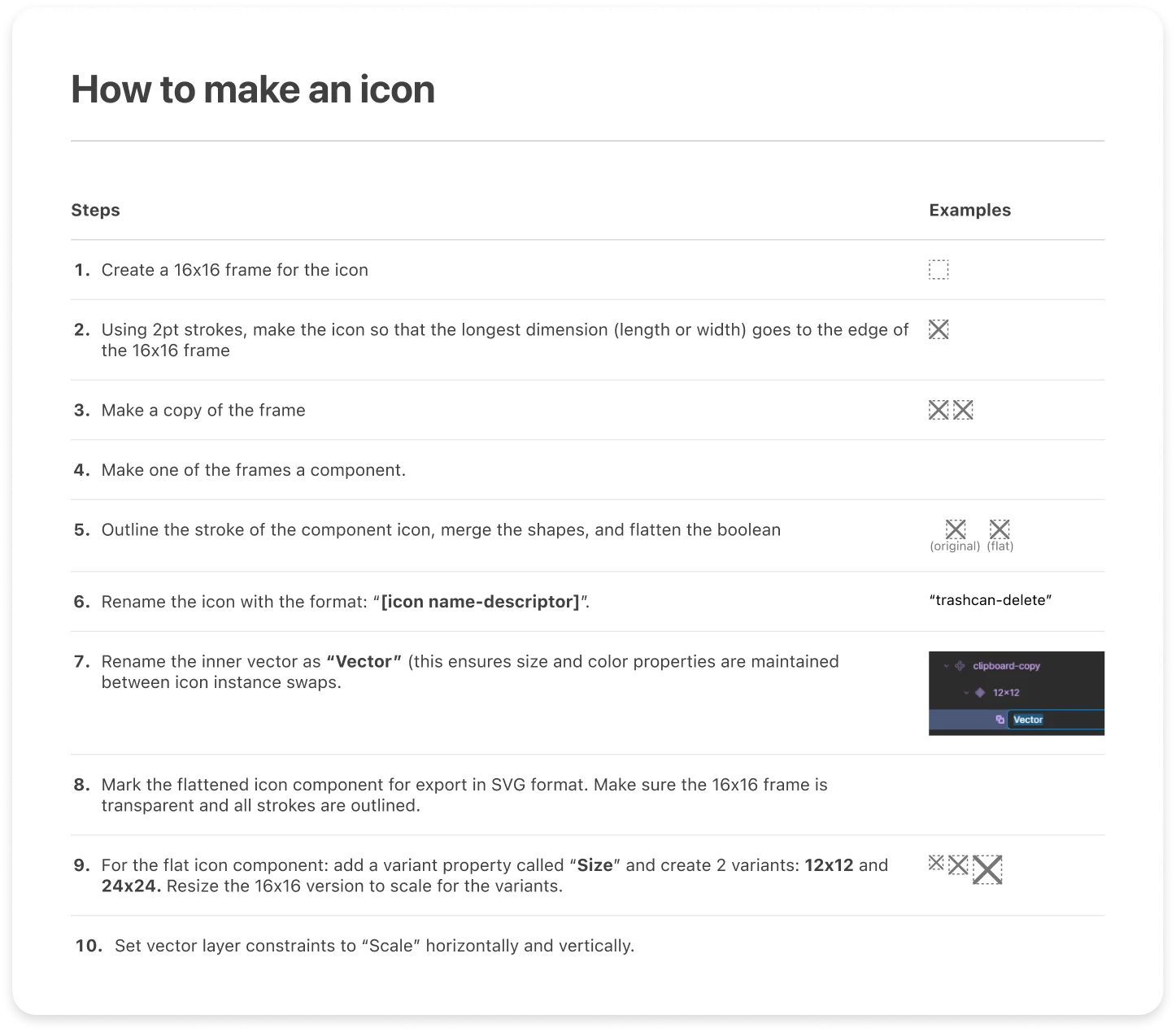
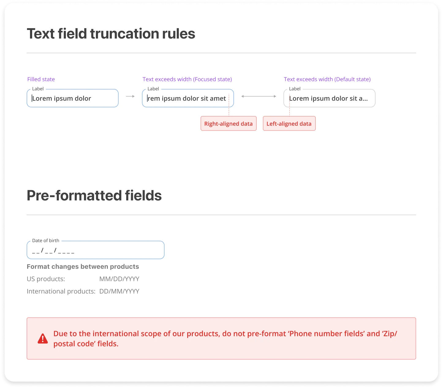
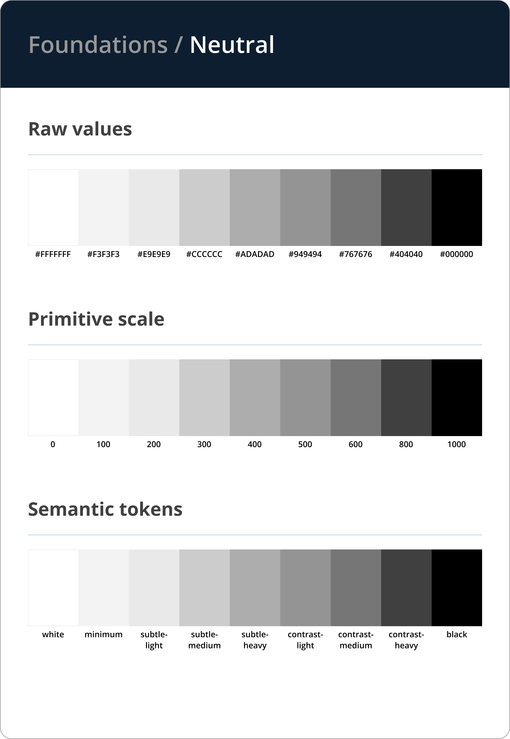
I built the system in layers: foundations, tokens, components, adoption. Each layer targeted a specific category of ambiguity.
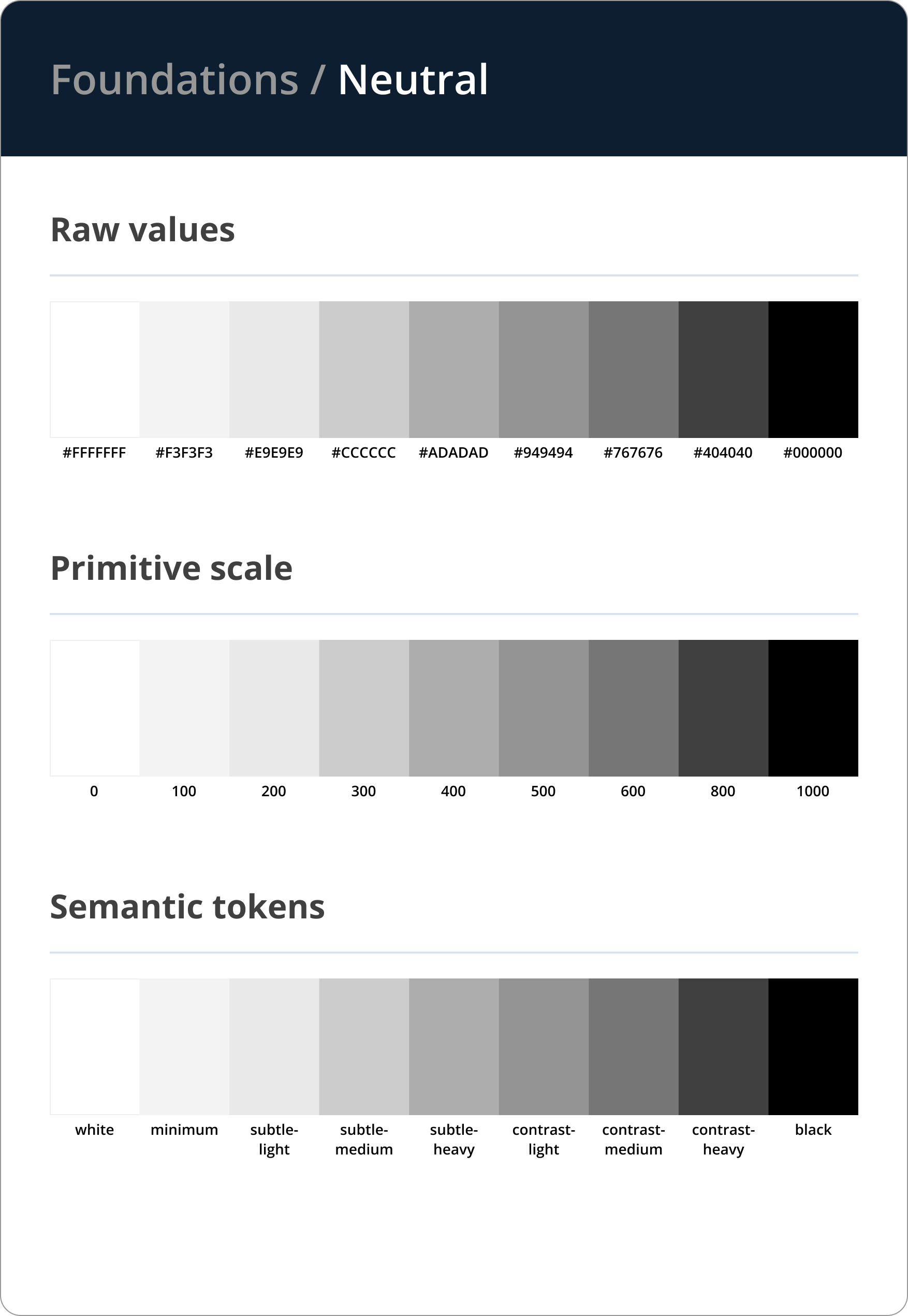
reu, nems, nanokard, and others — got its own named primitive token set. A rebrand or color switch cascaded through semantic and component tokens automatically. No component work. Just a mode switch.
PrimitiveRaw values. No context.
blue-700#0460E3neutral-0#FFFFFFneutral-900#0A0A0Aspace-44pxspace-1616pxradius-sm4pxSemanticNamed by role. References primitives.
text/brand-heavyblue-900text/defaultneutral-900text/subtleneutral-500surface/raisedneutral-50border/defaultneutral-200icon/interactiveblue-700ComponentScoped overrides. References semantic.
button/primary-bgsurface/brandbutton/primary-labeltext/on-brandbutton/disabled-bgsurface/disabledinput/border-defaultborder/defaultinput/border-errorborder/errorinput/labeltext/subtle- Ran onboarding walkthroughs with product and dev leads to embed the system into their workflows
- Identified highest-friction handoff points from Figma comments and prioritized documenting those — that gave teams a reason to open the docs
- Embedded system references into dev handoffs so the library became part of the process, not an optional resource
- Went back through each product and replaced raw hexcodes and detached instances with tokens and library components

Outcomes & Results
Figma comment threads stopped piling up. Handoffs that had required back-and-forth clarification became self-serve. Dev timelines shortened by ~25% as engineers pulled specs from token documentation instead of re-deriving values. Design-related comment threads dropped by ~70%.
Beyond the metrics, the bigger shift was organizational: design knowledge stopped living with specific people and started living in the documentation, available to anyone without asking. Engineers resolved spec questions from the docs without pinging design. Designs came back from engineering with fewer implementation errors.
Learnings: Changing how people worked was harder than building the system. Teams with workarounds need a concrete reason to switch. I'd establish the system from the first product.
I'd pair the Figma library with Storybook. Coded components previewed in isolation give engineers a buildable reference alongside the design specs, reducing the gap between what's designed and what ships. I built a proof of concept to show what that would look like in practice.
View Storybook POC